STRUZAN BALANCE PART 9
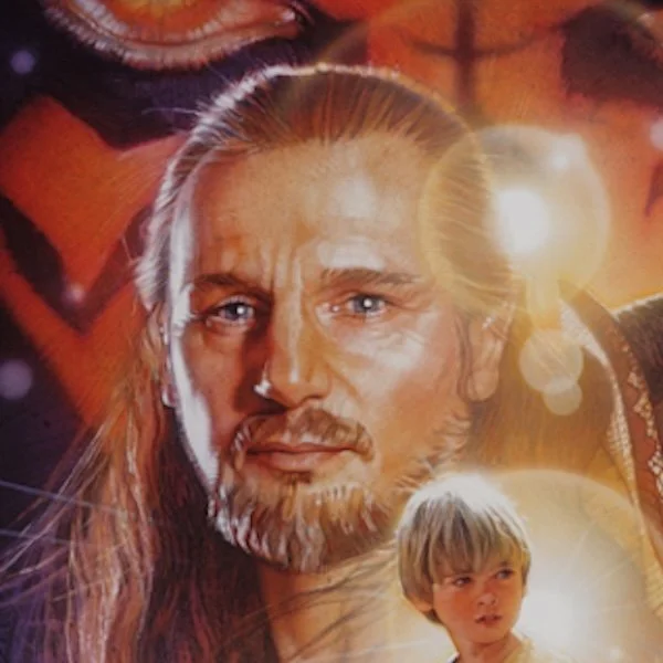
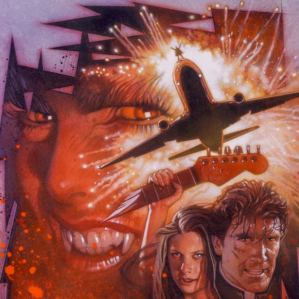
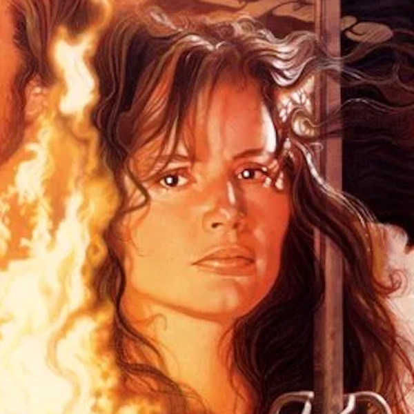
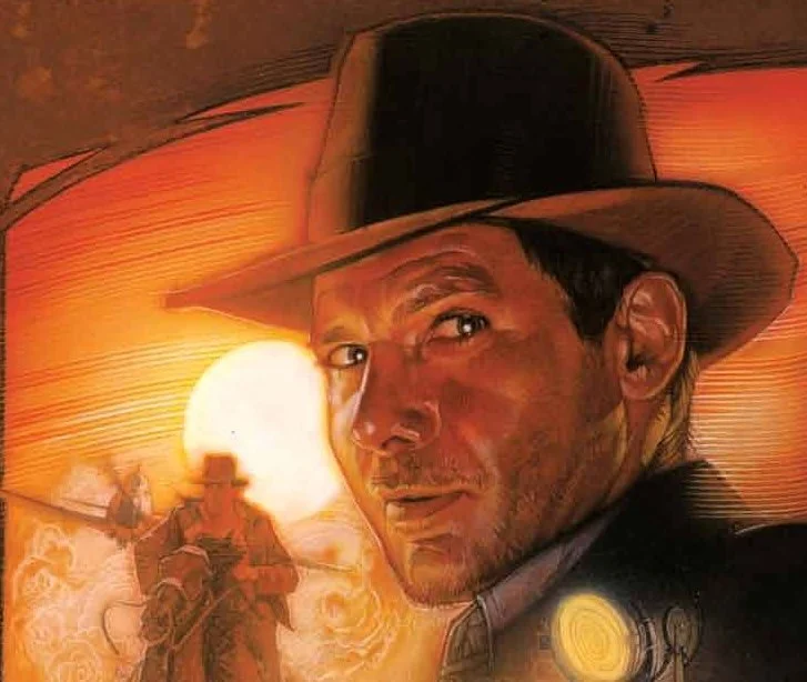
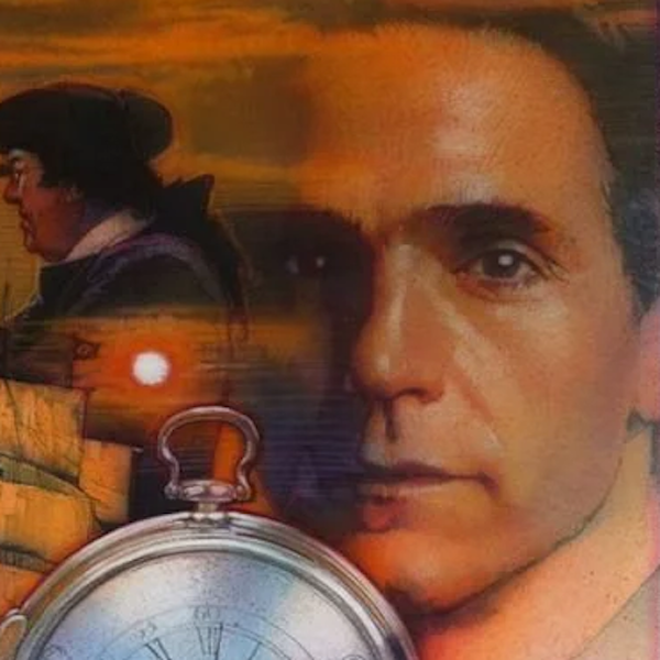
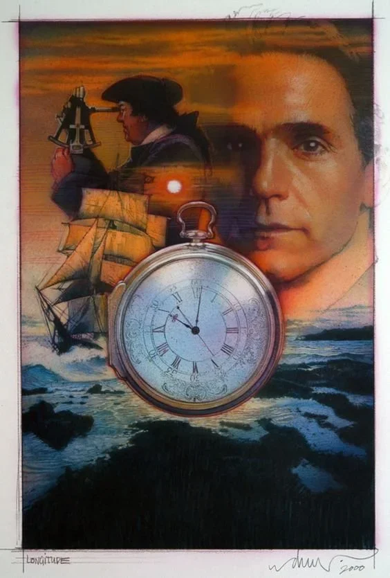
For this study, I wanted to look for patterns for the main heroes of Struzan’s posters and see how he arranged light sources next to their faces.
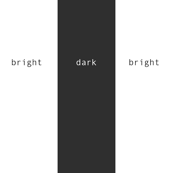
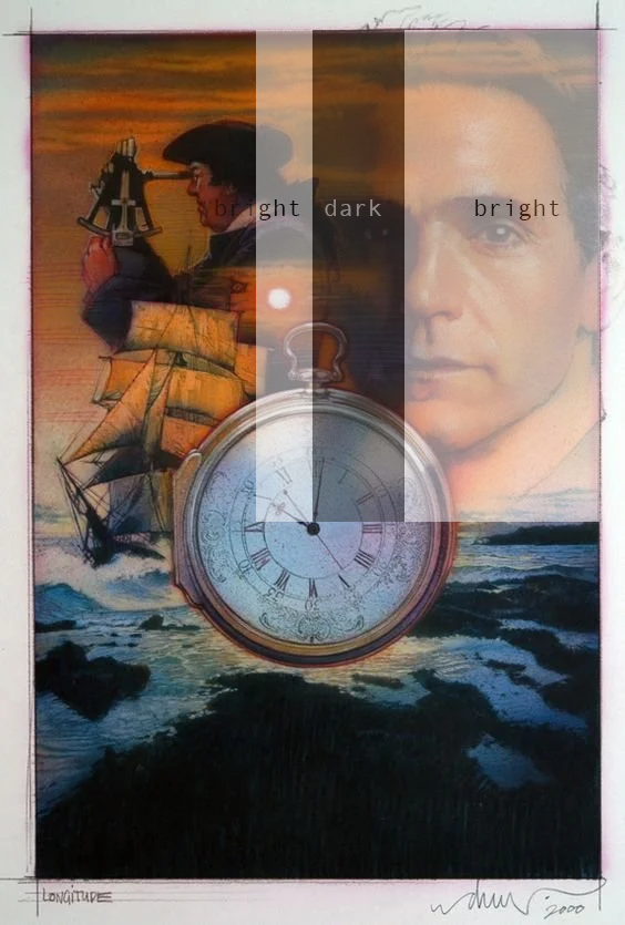
A common strategy seemed to be Bright, Dark, Bright. It places a bright light source next to the shadow side of the hero’s face, and not the bright side. It creates a dark sandwich:
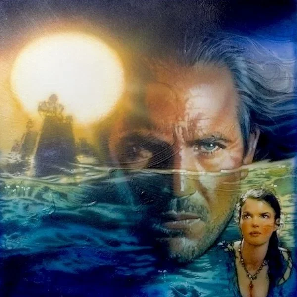
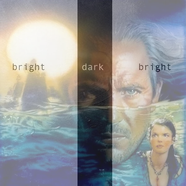
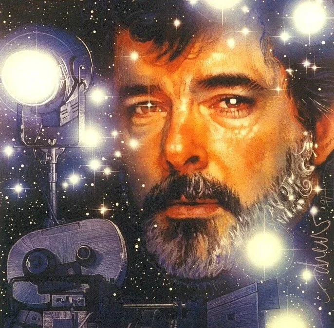
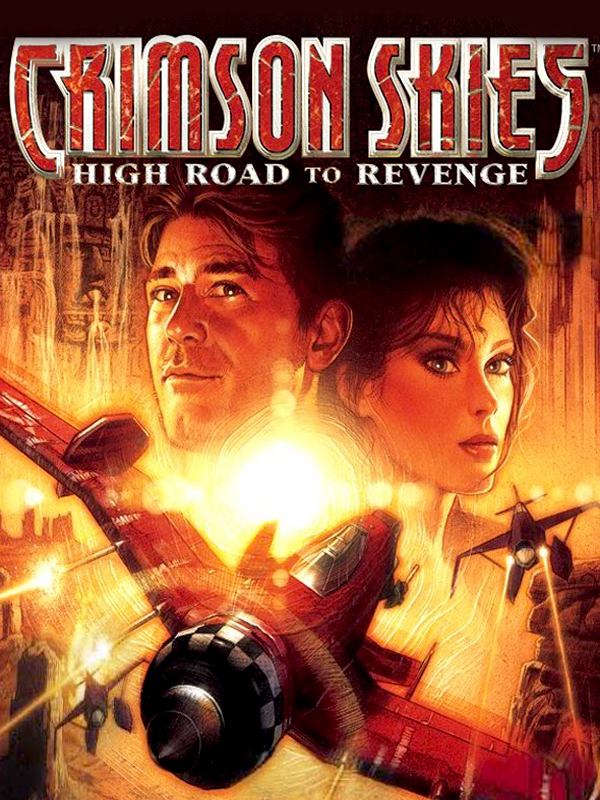
Dark, Light, Light
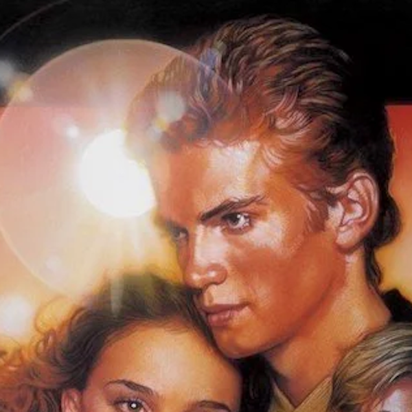
When Struzan does place a light source next to the lit side of the hero’s face, it seems that the light source is used to “light” the character: